Sean Dawn
a productivity app for the mind that won't stop
I watched someone I know — smart, capable, fully aware of what he needed to do — spend 40 minutes every morning thinking about starting instead of actually starting. He'd check his phone, open three apps, reorganize his to-do list, and by the time he moved, half the morning was gone and the guilt had already set in.
He wasn't lazy. Once he started, he was fine. The problem lived in a very specific gap: the space between knowing what to do and doing it. That gap is where overthinking lives.
Problem statement: an overthinker who thrives with external accountability but is paralyzed without it — productive when channeled, stuck when the time is open and the direction is his to choose.
A day in the life
Understanding the pattern
I needed to know if this was one person's quirk or a shared pattern. I conducted an in-depth interview with Sean and supplemented it with online research — forum threads, app store reviews, articles on overthinking and task initiation — to see if others experienced the same friction.
The most important finding: once Sean started, he was fine. The first two minutes were the only hard part. Online research confirmed this pattern was widespread — forums and reviews were full of people describing the same gap. I wasn't designing a productivity system. I was designing a starter.
Affinity themes
I grouped observations from Sean's interview and online research in FigJam. Six clusters emerged:
The "Tool Frustration" theme was telling. Sean had tried Notion, Todoist, Asana — every one gave him more choices at the exact moment he needed fewer. The tools were making the problem worse. Online research confirmed the same complaint across forums and app reviews.
Competitive positioning
I mapped the productivity space on two axes: more features vs. fewer features, planning-oriented vs. doing-oriented. Most tools clustered together — many features, heavy on planning. The opposite corner — fewer features, biased toward doing — was almost empty. That's where Sean Dawn would live.
From map to prototype
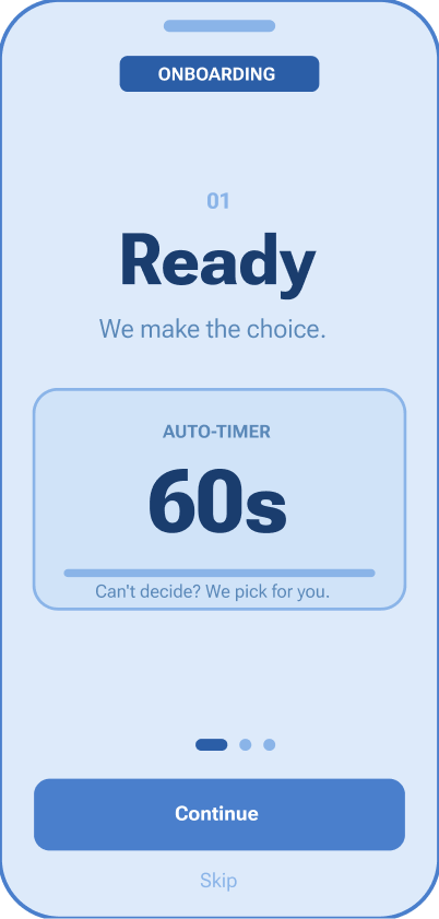
The key iteration: auto-commit
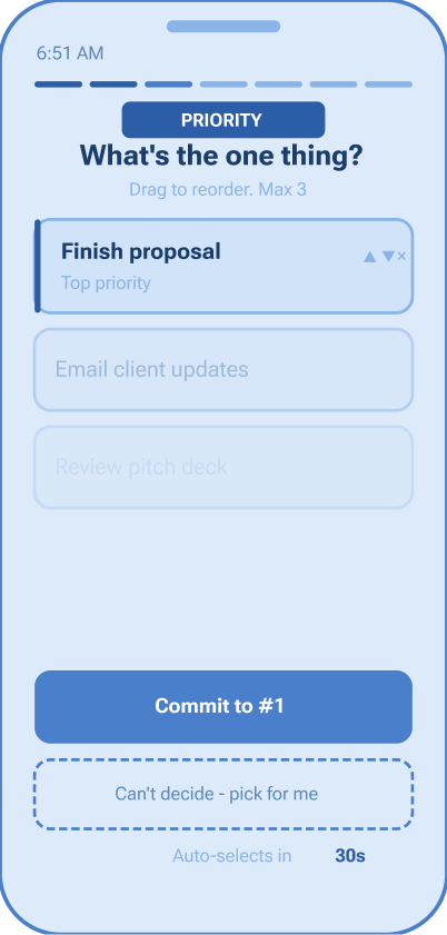
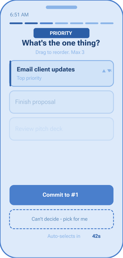
When participants reached the morning priority screen, they stalled — even with only 2–3 options. The very problem the app was meant to solve was happening inside the app.
The fix: a 60-second auto-commit timer. If the user doesn't choose within a minute, the app chooses for them. One tester said: "Knowing it would pick for me actually made it easier to pick myself."
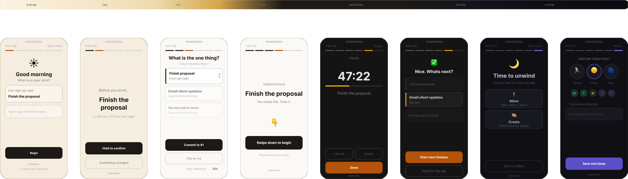
One screen, all day
Sean Dawn is a mobile app built on one principle: fewer choices at the right moment. No tab bar, no settings rabbit hole, no feature grid. One screen that transforms based on the time of day.
8 phases
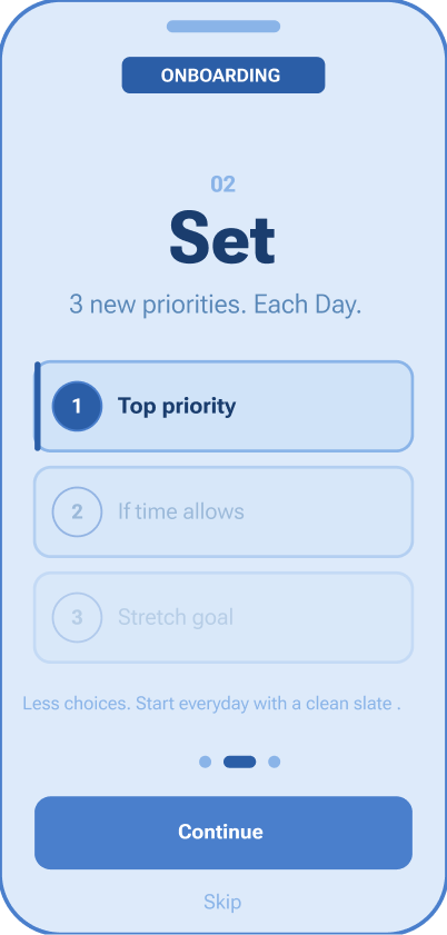
Onboarding
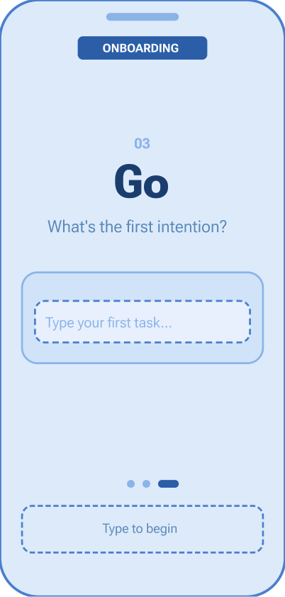
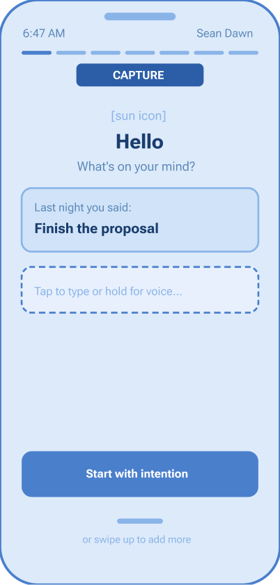
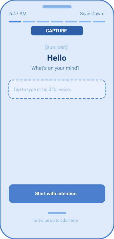
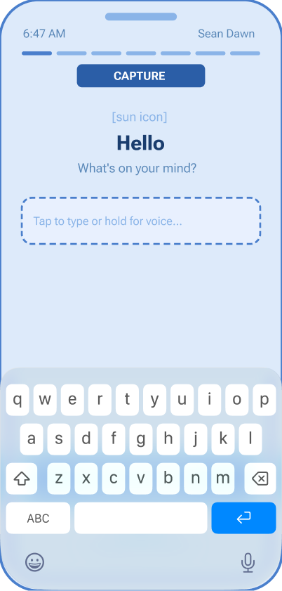
Capture
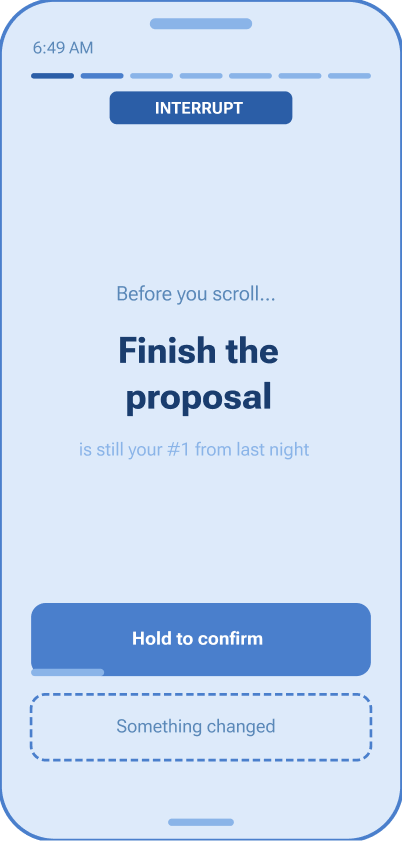
Interrupt
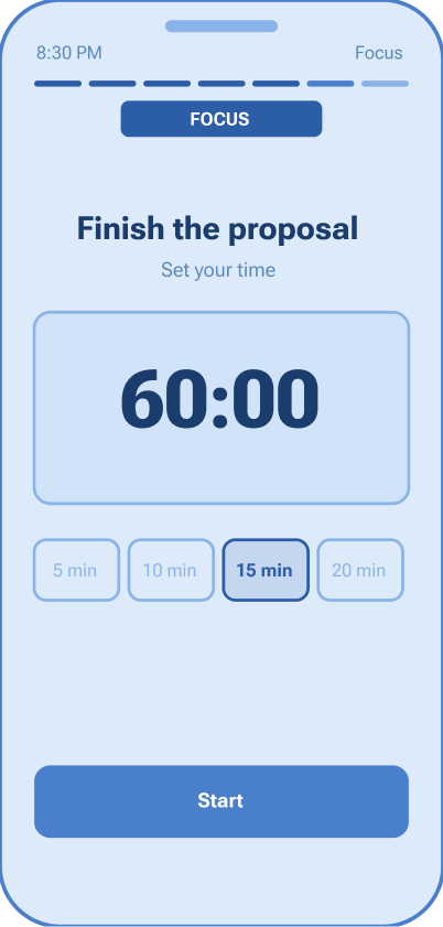
Prioritize + Start
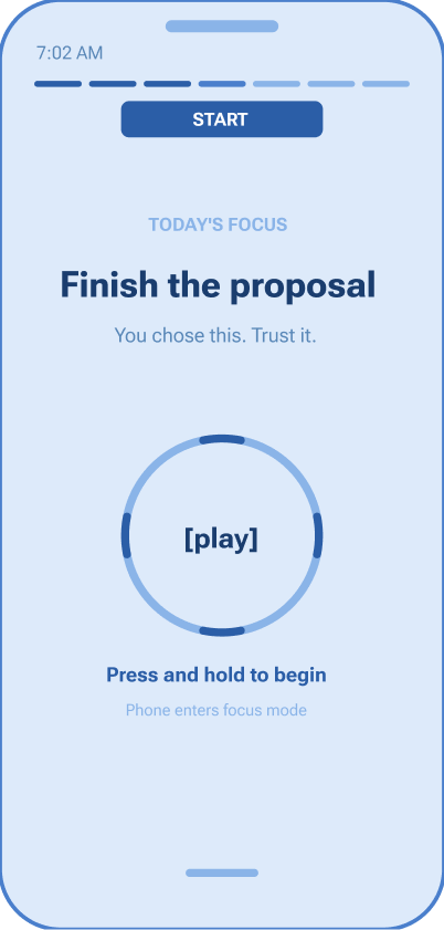
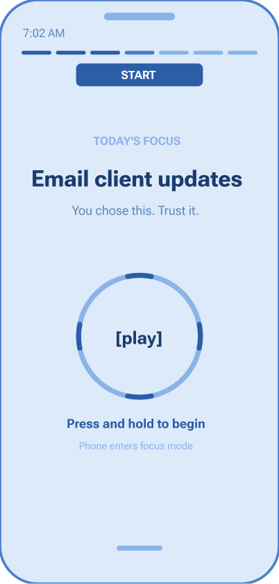
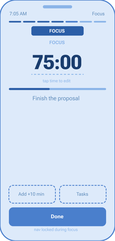
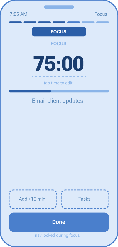
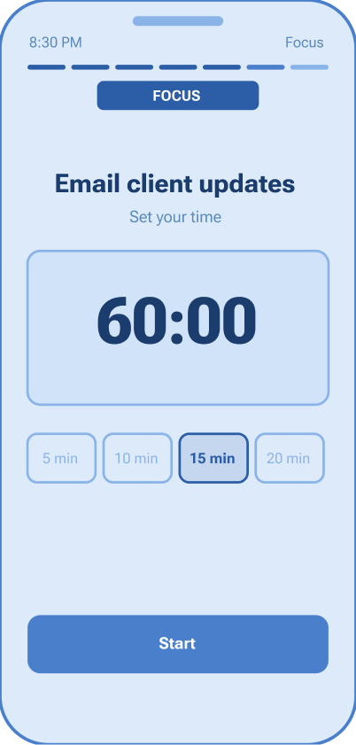
Focus
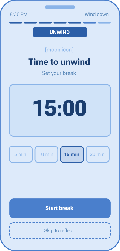
Unwind
Reflect
Design principles
Fewer choices at the right moment. Max 3 items on the priority screen. Auto-commit at 60 seconds. The app decides if you don't.
Gestures as rituals. Swipe down to commit. Hold to extend focus. Tap to reflect. Physical gestures create intention that button presses don't.
The screen is the clock. Warm gold in the morning. Dark charcoal during focus. Deep indigo at night. You always know where you are without reading a word.
No escape routes. During focus mode, navigation is locked. The only options: extend, view tasks, or done.
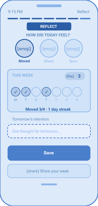
The reflection loop
End of day, one question: how did today feel? Three options, one tap.
Not good or bad. Moved means you started and stayed present. Spun means overthinking won. Mixed is most days. Over time, the weekly dots build a pattern — no journaling, no analytics dashboard, just one honest signal each day.
What testing showed
All 6 test participants completed the core flow — capture, prioritize, start, reflect — without guidance. Onboarding took under 15 seconds after being simplified from 5 screens to 3. The auto-commit timer was the most discussed feature: initially surprising, then universally appreciated.
What I'd do differently
The research was one interview and secondary sources — directional, not definitive. A larger participant pool and a diary study would capture real-time behavior rather than recall. The color-shifting screen also needs iconography and haptic feedback alongside color — state shouldn't live in color alone.
What this taught me
The biggest lesson was restraint. Every instinct as a designer is to add — more features, more options, more flexibility. Sean Dawn forced me to do the opposite. The hardest screen to design wasn't the most complex one. It was the one with almost nothing on it.